Drinkwell

PROJECT: Drinkwell BRAND
CLIENT: Drinkwell
I WORKED ON:
LOGO, BRAND GUIDELINES, CUSTOMER EXPERIENCE
TIMELINE:
2017
LOCATION:
bangladesh
Drinkwell is a technology company that constructs water purification solutions in Bangladesh and beyond. I partnered with them to create a new visual identity and brand.
Challenge
In Bangladesh, the water supply is plagued by arsenic contamination. Arsenic is a colorless, odorless, naturally occurring metal, and when ingested it can lead to illness, diarrhea, and a cancer-causing disease called arsenicosis. Diseases like E. coli are common, as providers do not follow quality standards. Drinkwell uses their patented water purification technology to provide affordable, safe drinking water at 10x higher efficiency than other solutions.
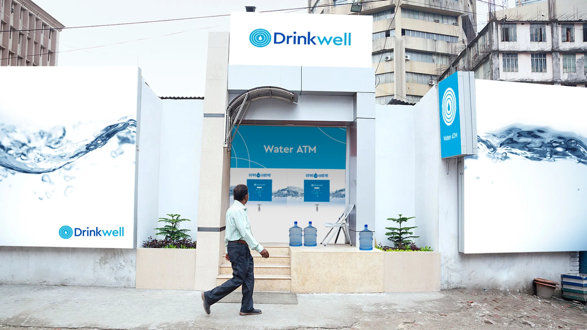
While focused on their technology, Drinkwell was now ready to be more customer-facing. They were starting to take on a new service model that allowed customers to use reloadable debit cards to withdraw water through an ATM interface. During this time of expansion, Drinkwell needed a more polished and consistent visual identity that would earn recognition and customer trust.
My Role
I was given the task of creating a new logo and visual identity. My work started around the the proposition of safety and how I could, in a very rudimentary way, communicate the concept of clean, purified water. I landed in the idea of three rings encapsulating a drop of water. In collaboration with the client these came to stand for purification, safe storage and delivery.
For their forthcoming water ATM system, we discussed the user flow and what brand touch-points they would require to create a seamless and recognizable Drinkwell experience. The design of the ATM card was very important, as this would for most customers be the first card with an assigned value that they had ever owned – and something they would carry with them at all times.
The design of the ATM card was very important, as this would for most customers be the first card with an assigned value that they had ever owned – and something they would carry with them at all times.
For the ATM system, the most important thing was that the customers, who in many cases are illiterate, could easily understand the basic action of touching their card to the RFID reader and dispensing the water. The client had already invested in a dispensing solution, which meant that no changes could be made to the ATM button layout – but I could affect the cosmetic design. The solution was a large vinyl sticker that could easily be pasted on top of the interface. I used the three circles from the logo to clearly signify the RFID-reader area and surrounded it with a visceral image of clear, blue, flowing water.
I also came up with a vest design that the Drinkwell representatives could wear. The representatives meet with community members, maintain the water ATMs and help customers. Previously they had worn lab coats, which would get hot in Bangladesh’s subtropical climate and did not accurately represent what their job was. The vest is lightweight, breathable and set in Drinkwell’s light blue.
A pump caretaker meets with the community to distribute Drinkwell RFID cards, that can be charged and used to dispense fresh water from Drinkwell pumps
People lining up to collect fresh water at a Drinkwell pump
Purified Drinkwell water costs around 1/2¢ per liter
Outcome
Even though the CEO was at first hesitant at the idea of changing the visual identity, he was delighted with the work and I am so happy to have been able to help Drinkwell’s cause in a small way.
Drinkwell is currently assisting Dhaka WASA, responsible for providing 17 million people with safe drinking water, in becoming the first megacity to provide access to safe water to all citizens. They have a network of Water ATMs, 300 systems across the city to date – and are working on expanding into India and Cambodia.


