Jawbone

PROJECT: Jawbone Packaging
CLIENT: Jawbone
What i worked on:
logo, packaging design
TIMELINE:
2013-2016
LOCATION:
San Francisco
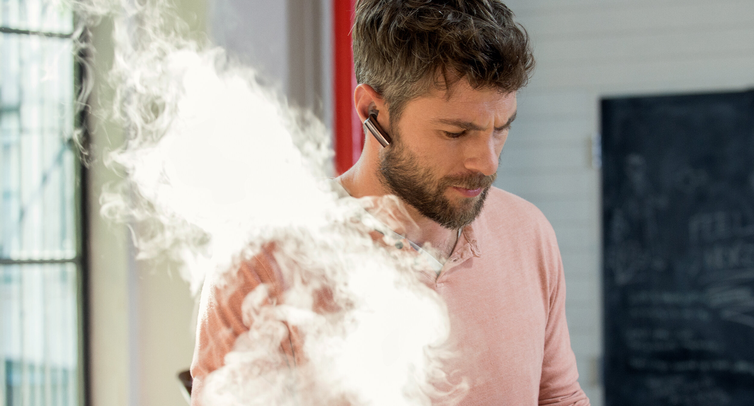
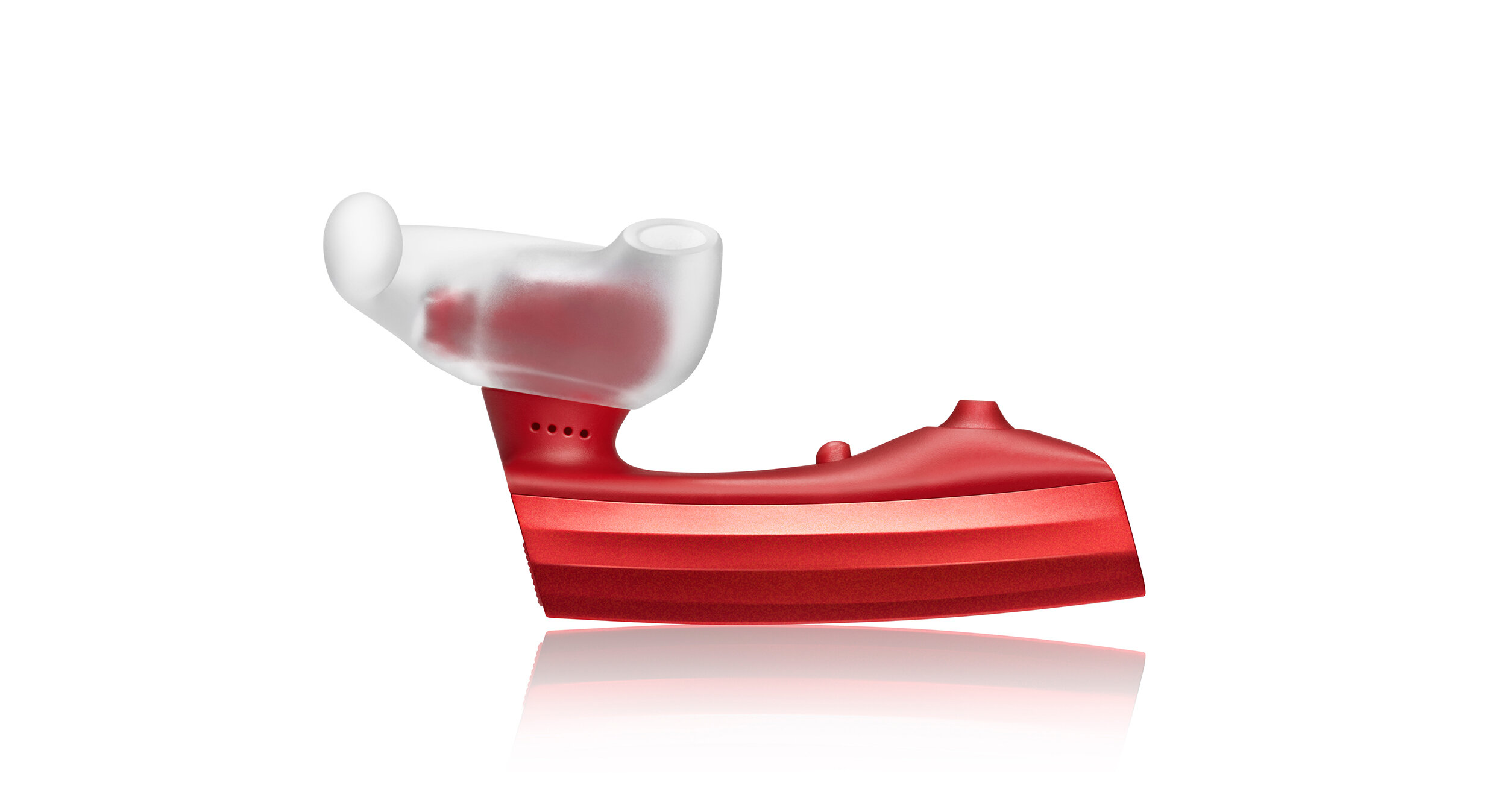
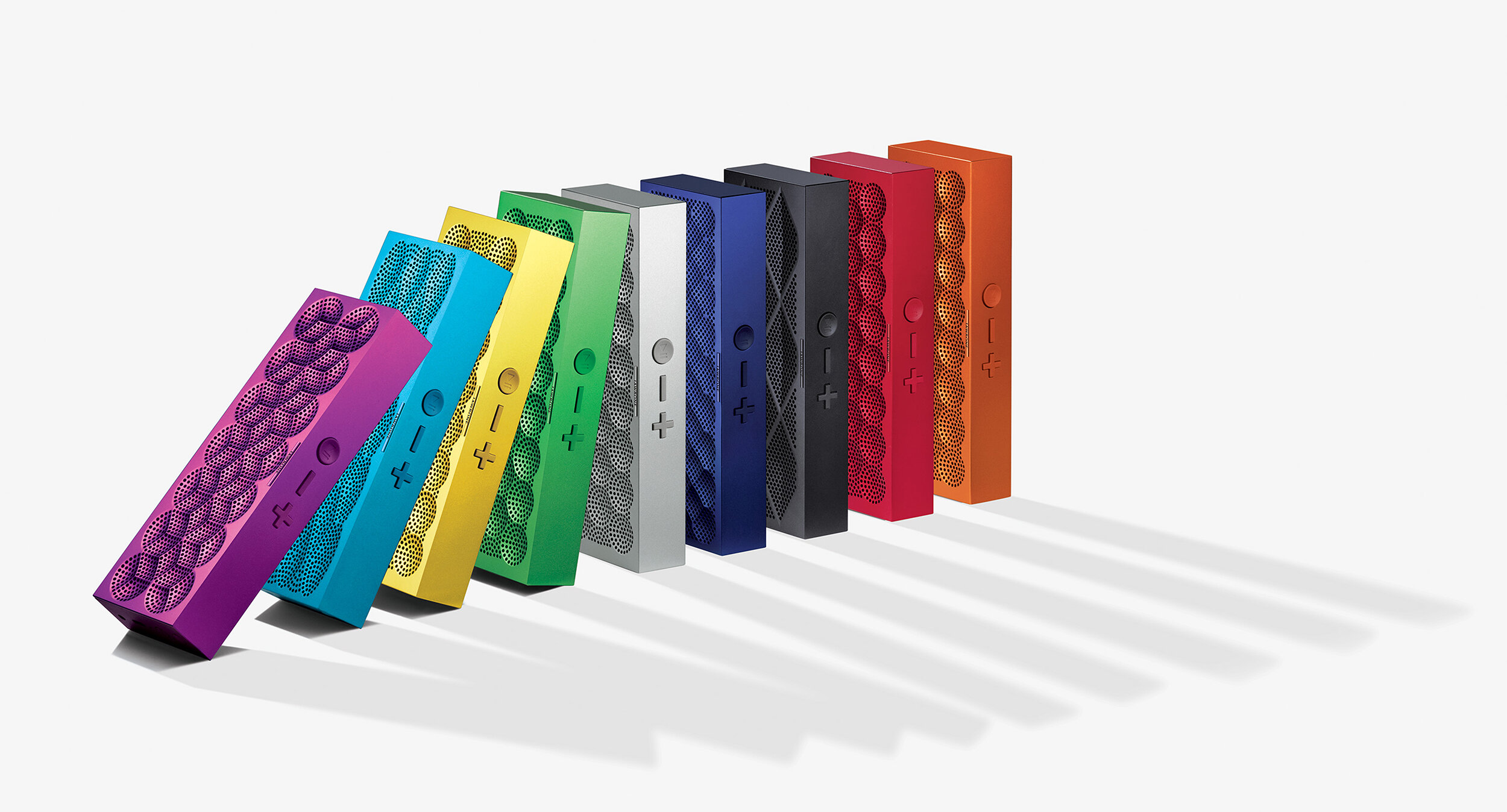
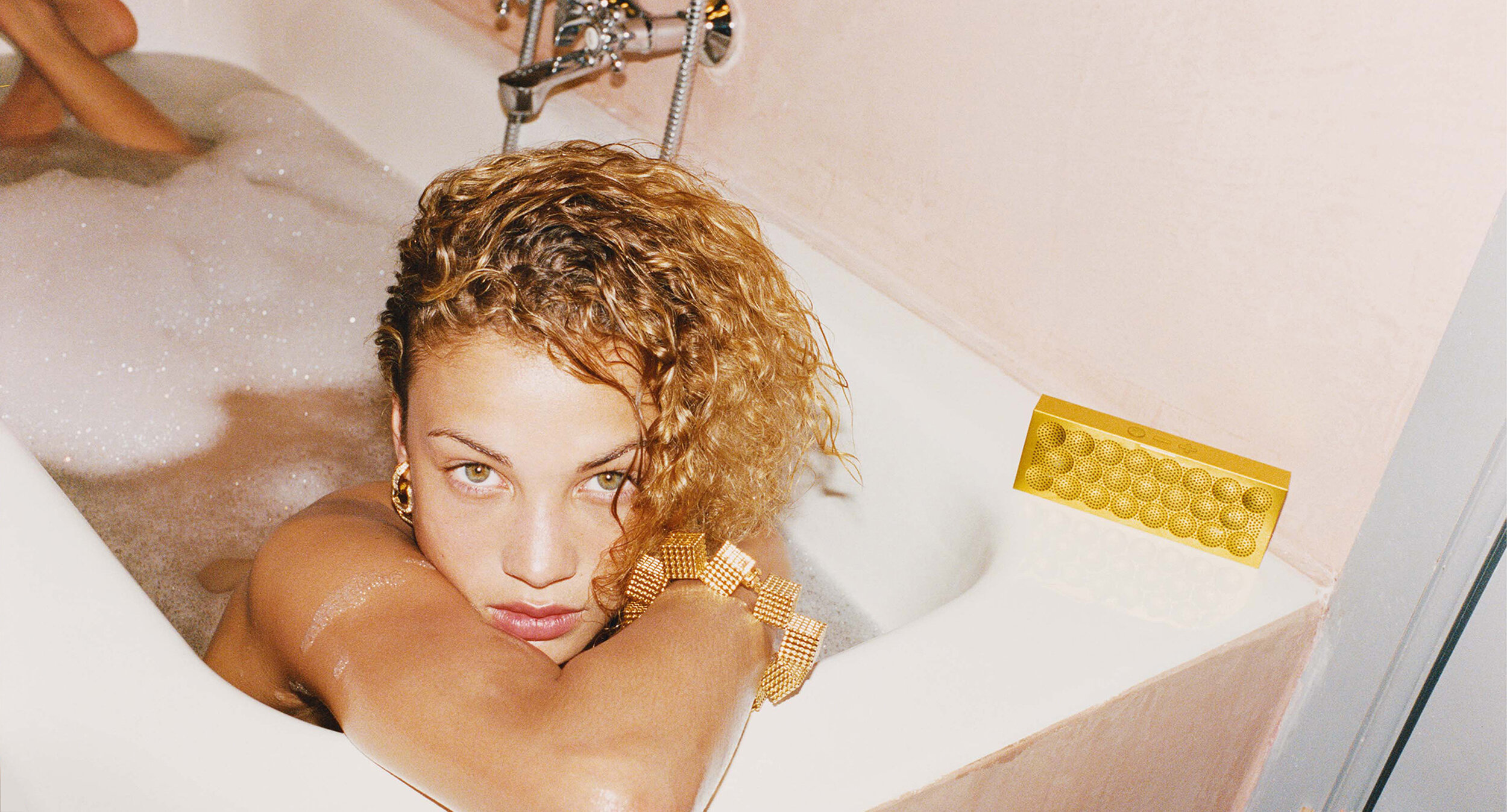
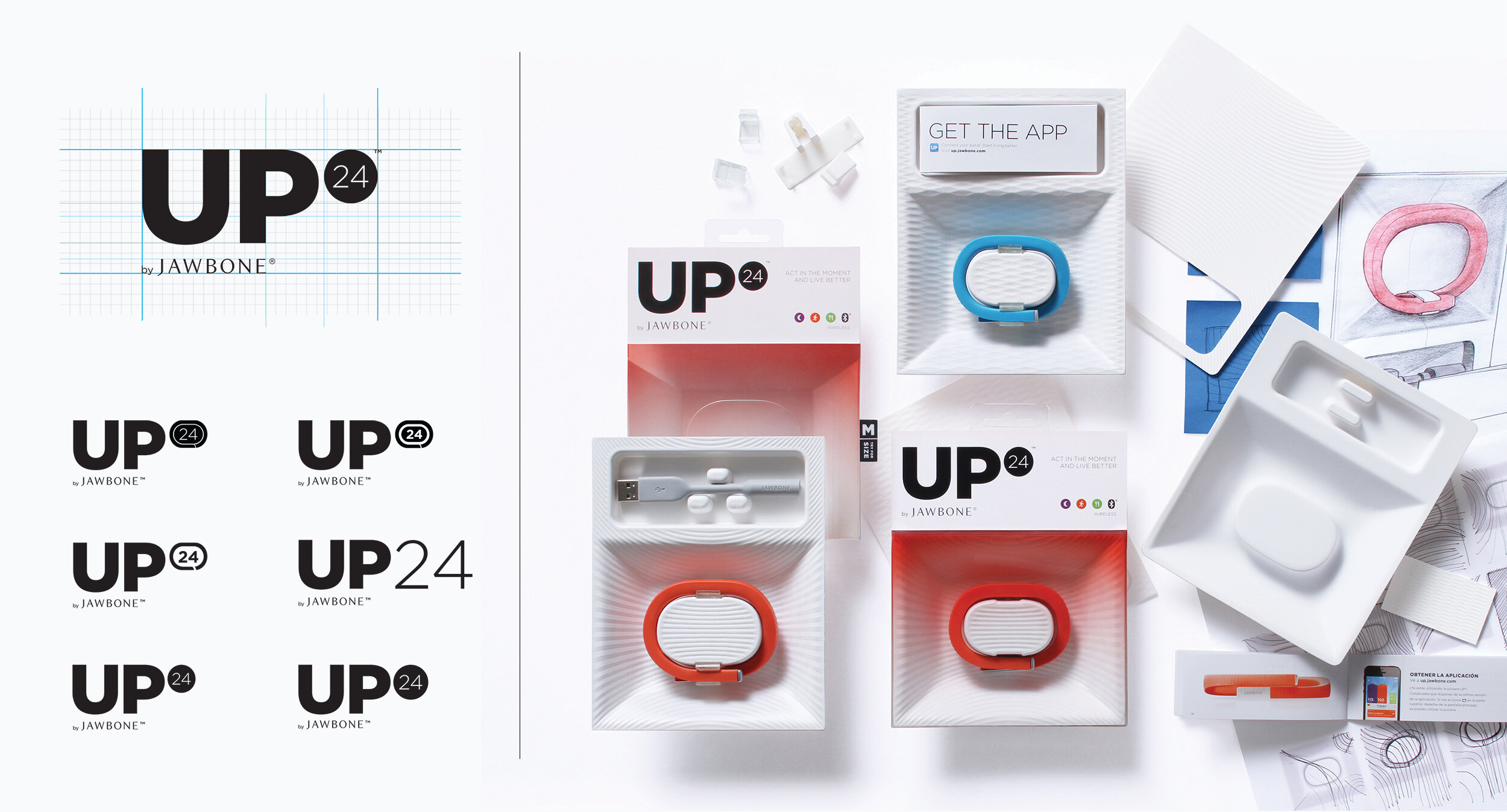
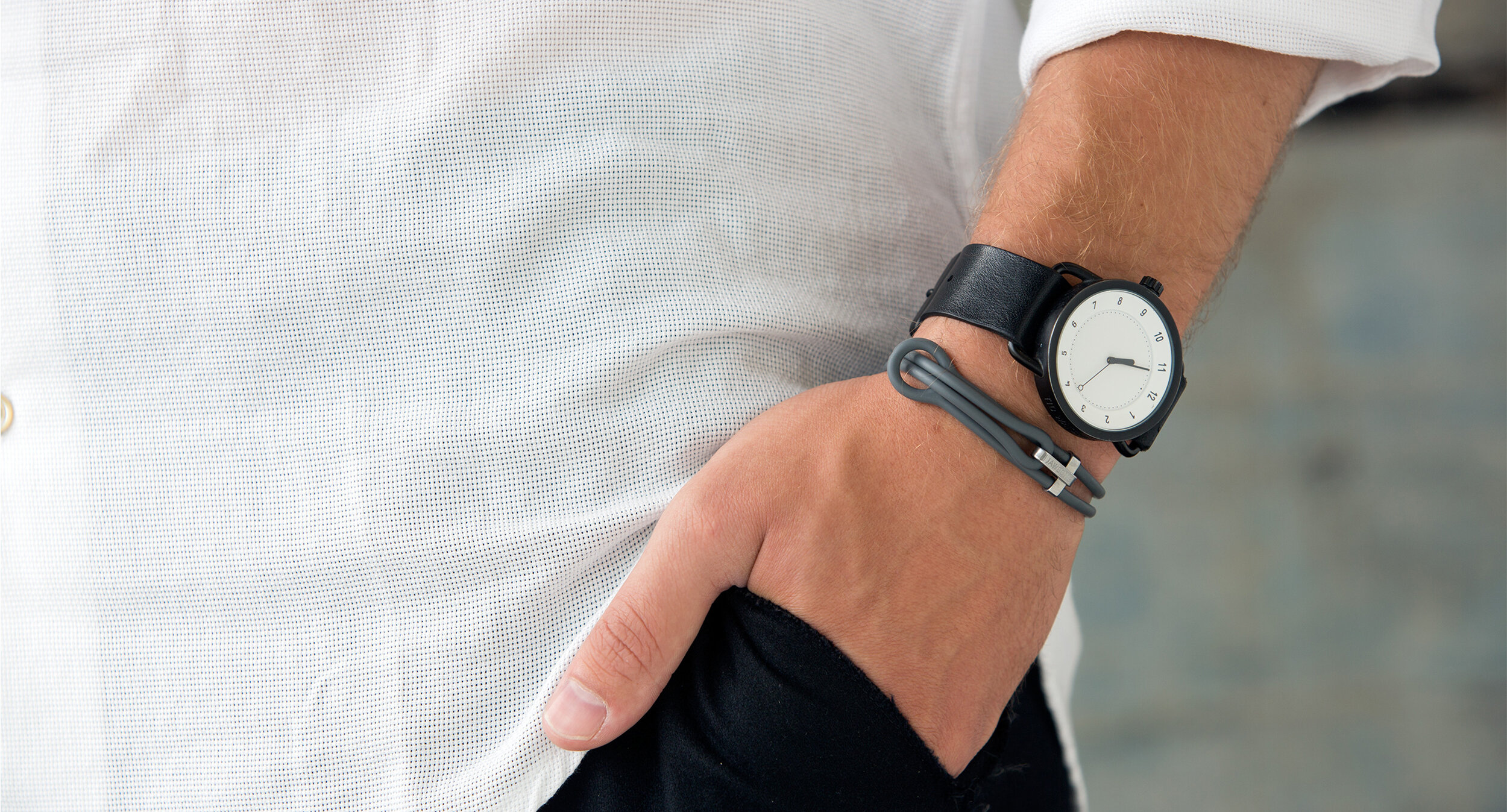
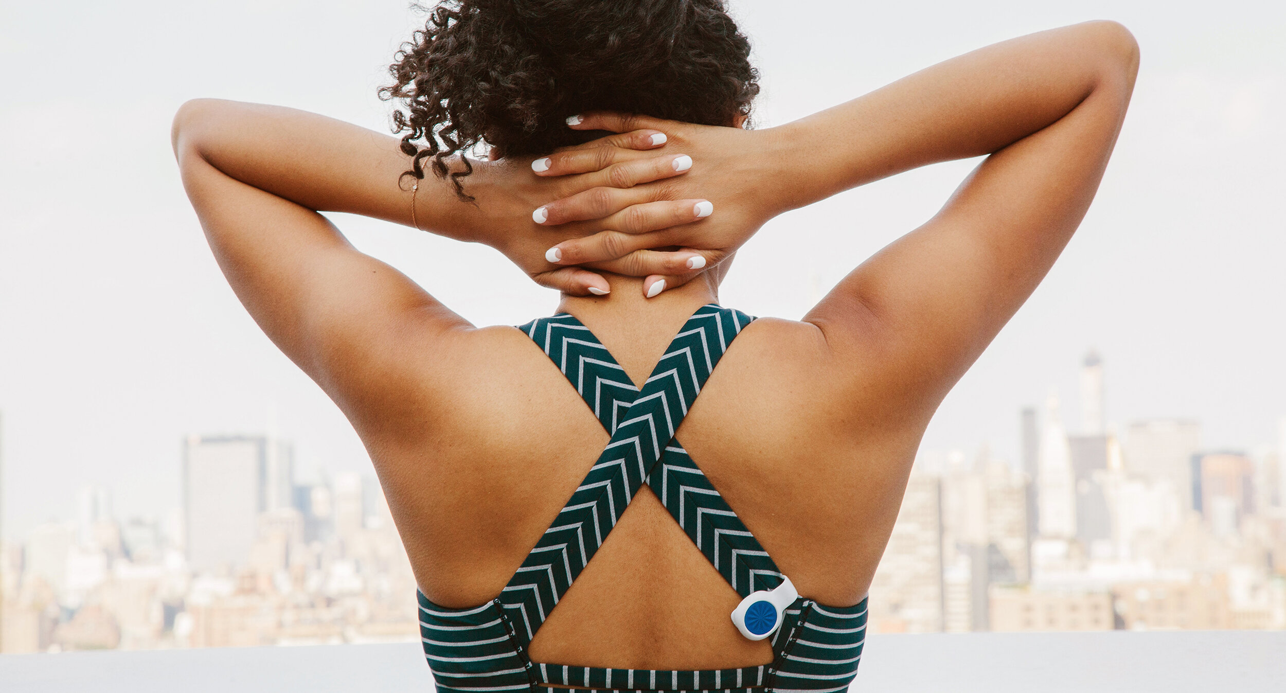
During my time at fuseproject, I have been involved with several Jawbone products – from the ERA headset and UP activity bands, to the pocket-sized Bluetooth speaker Mini Jambox. Apart from developing logos and working on UI – my main focus was the packaging; doing layout, selecting materials and creating prototypes.
Challenge
The Jawbone brand is known for its use of premium materials and colorful designs – making for a strong visual identity that stands out in the market. Therefore, our approach for all Jawbone packaging was to let the product speak for itself – drawing inspiration from the way one would display a jewel in a museum – while keeping the packaging materials at a minimum.
ERA
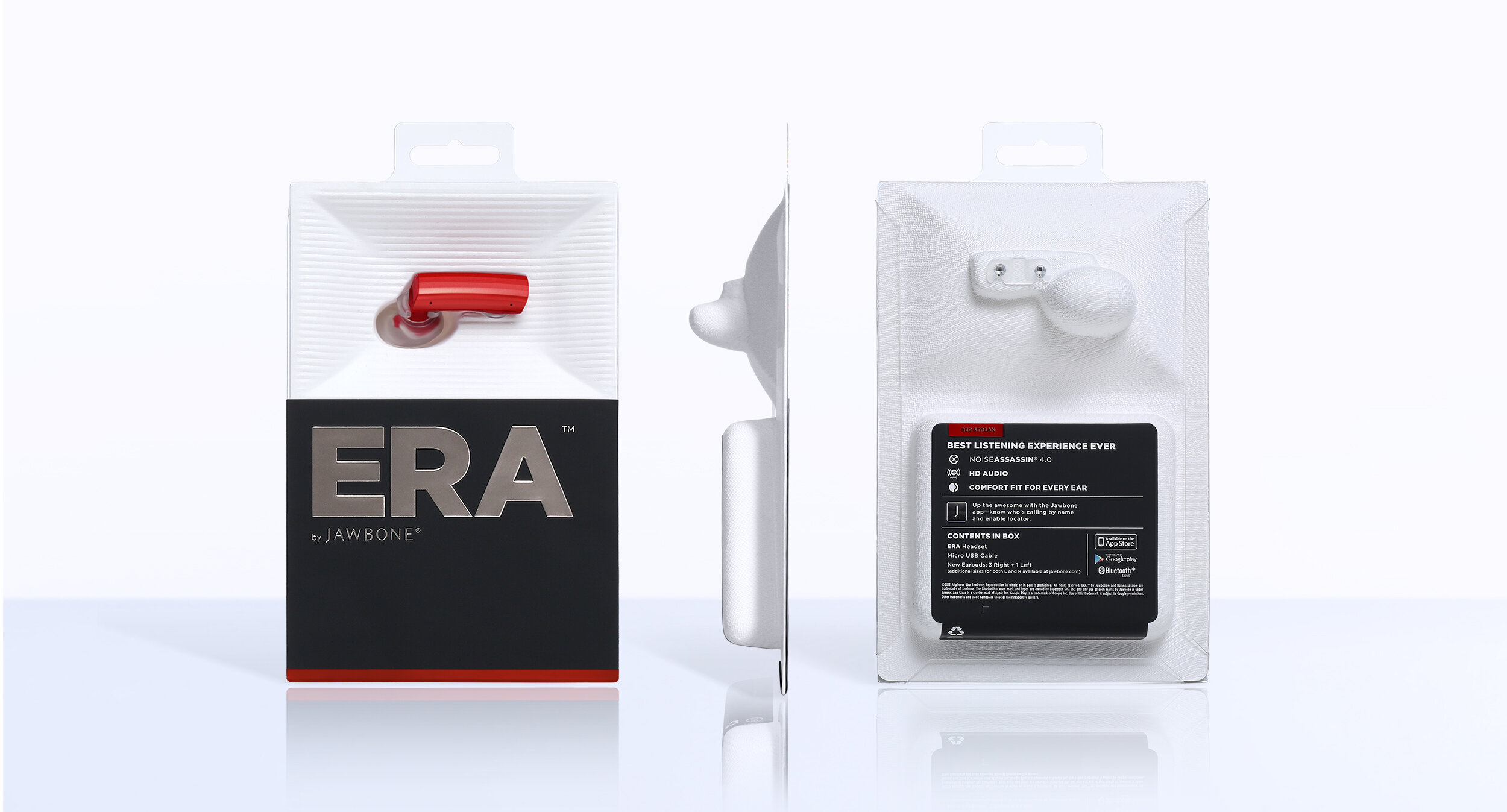
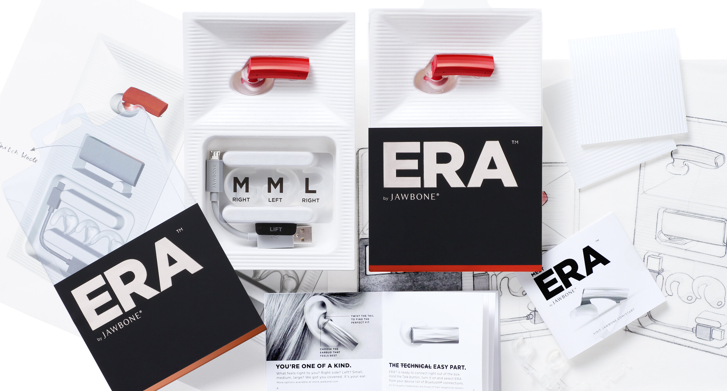
The ERA headset is positioned on an angle that allows consumers the ability to view the products complete form and scale. The packaging is made from a modeled pulp fiber tray and uses 97% recycled material by weight. The black sleeve is made from a matte soft-touch paper, coupled with an embossed foil treatment.
The Dieline Awards, 1st Place, Technology, Games & Toys, Media & Self-Promotional, 2014
The Dieline Awards, Best Sustainable Packaging, 2014
Mini Jambox
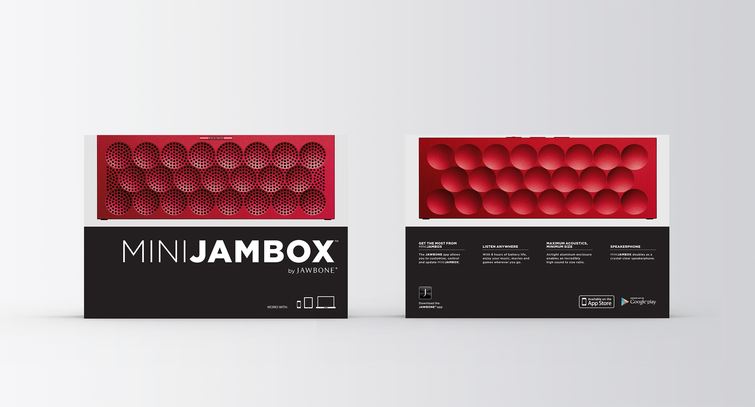
The Mini Jambox visual language follows that of previous Jawbone products, in that it is a pure celebration of innovative materials and arresting colors. The front of the packaging was stripped of all secondary information, maximizing the focus on the speaker, which appears at a 1:1 scale. To further highlight form and materials, we used a patterned high-gloss finish that captures the light and showcases the product’s texture.
International Design Awards, Product of the Year, 2013
Red Dot Product Design Award, 2014
IDEA, Silver, 2014
SPARK Awards, Product Award, 2013
UP24
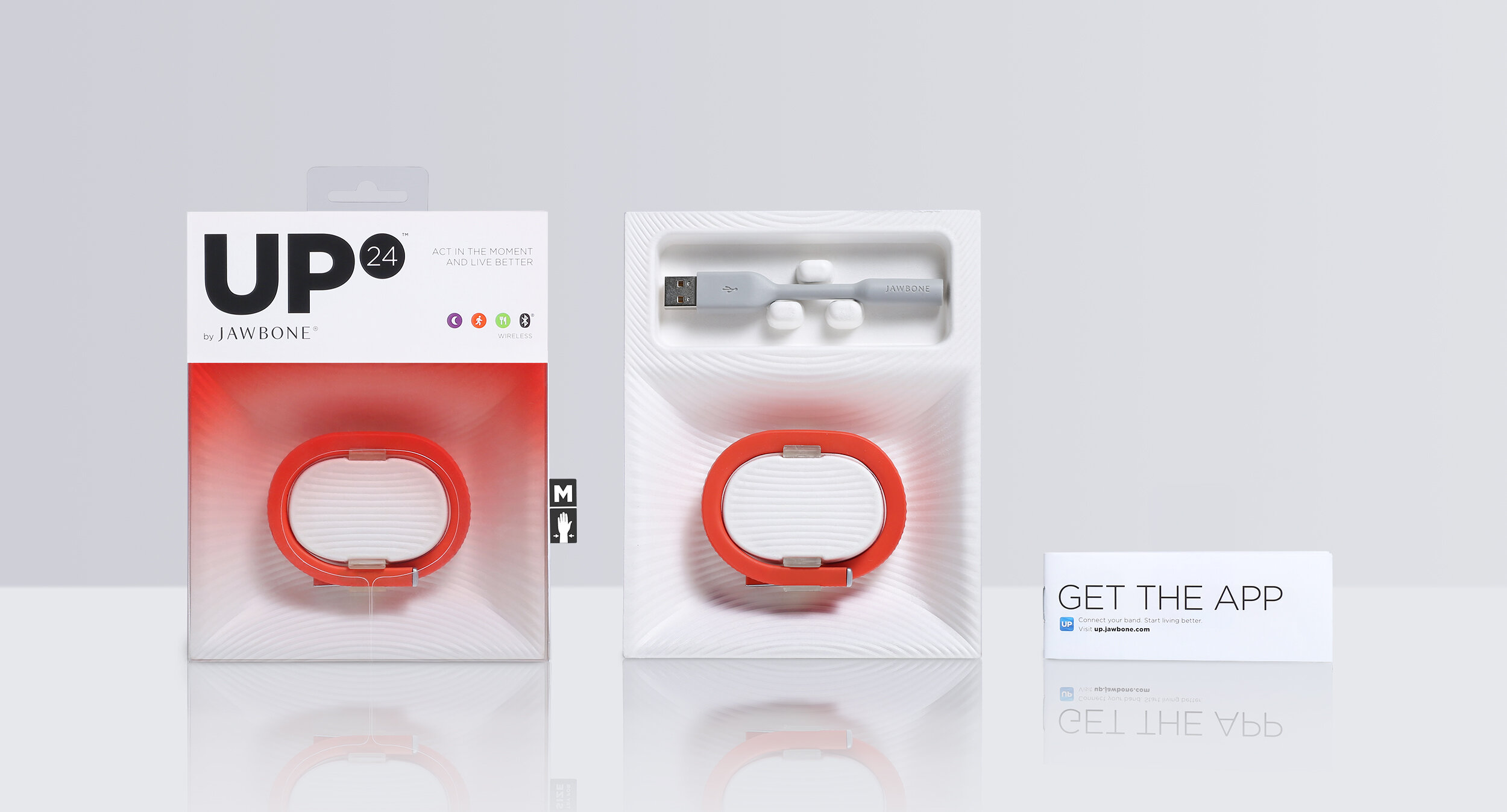
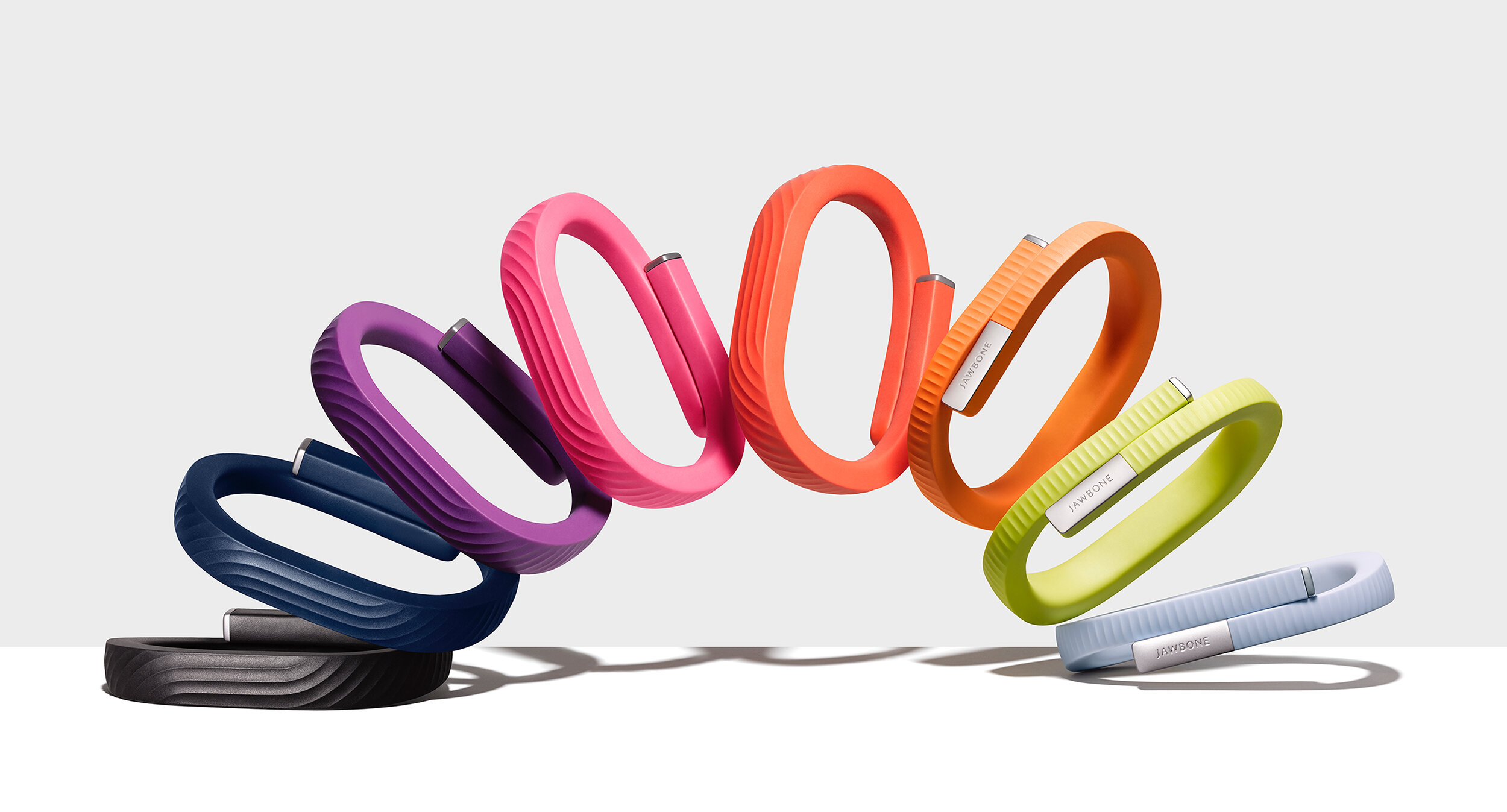
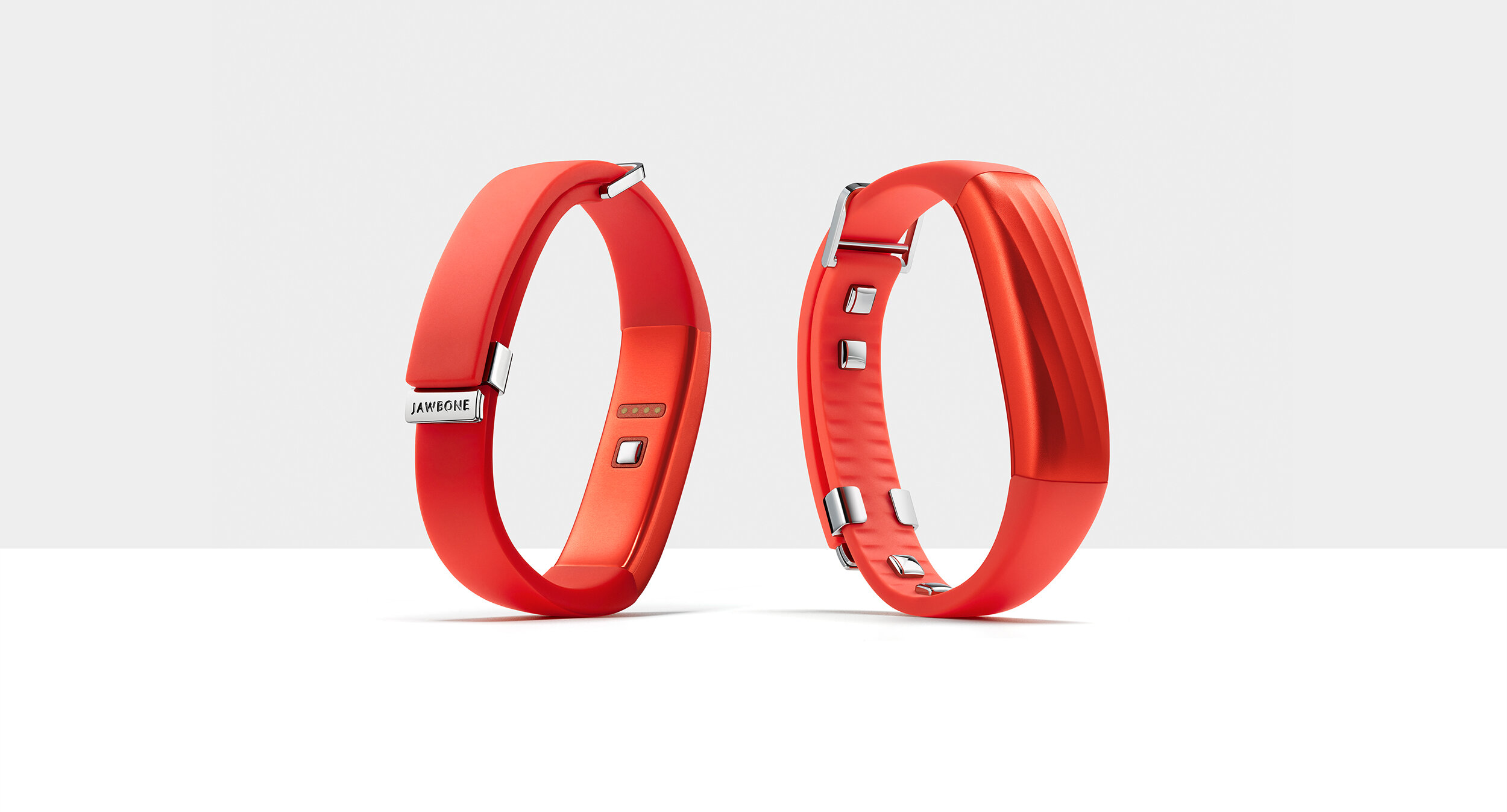
Consistent with the rest of the Jawbone products, the most important components of the brand expression are color, textures and materials. We used vibrant color gradients to highlight customization, innovative eco-friendly materials to reduce waste, and created a packaging paradigm that captures light to maximize shelf presence.
International Design Awards, Gold, 2013
Red Dot Product Design Award, 2014
IDEA, Bronze, 2014
The Dieline Awards, 3rd Place, Technology, Games & Toys, Media & Self-Promotional, 2014
The Dieline Awards, Best Sustainable Packaging, 2014
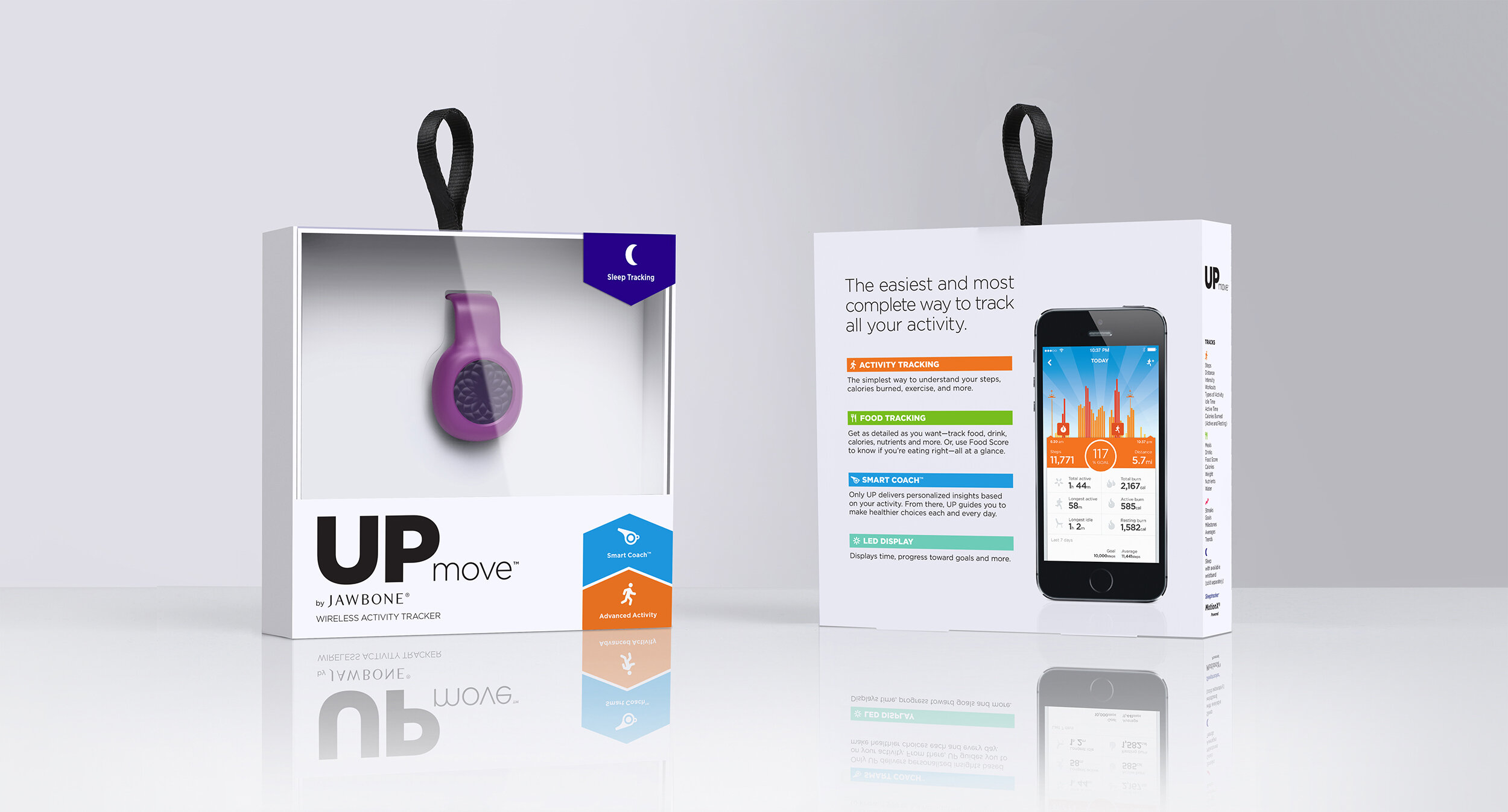
UP2, UP3 & UP Move
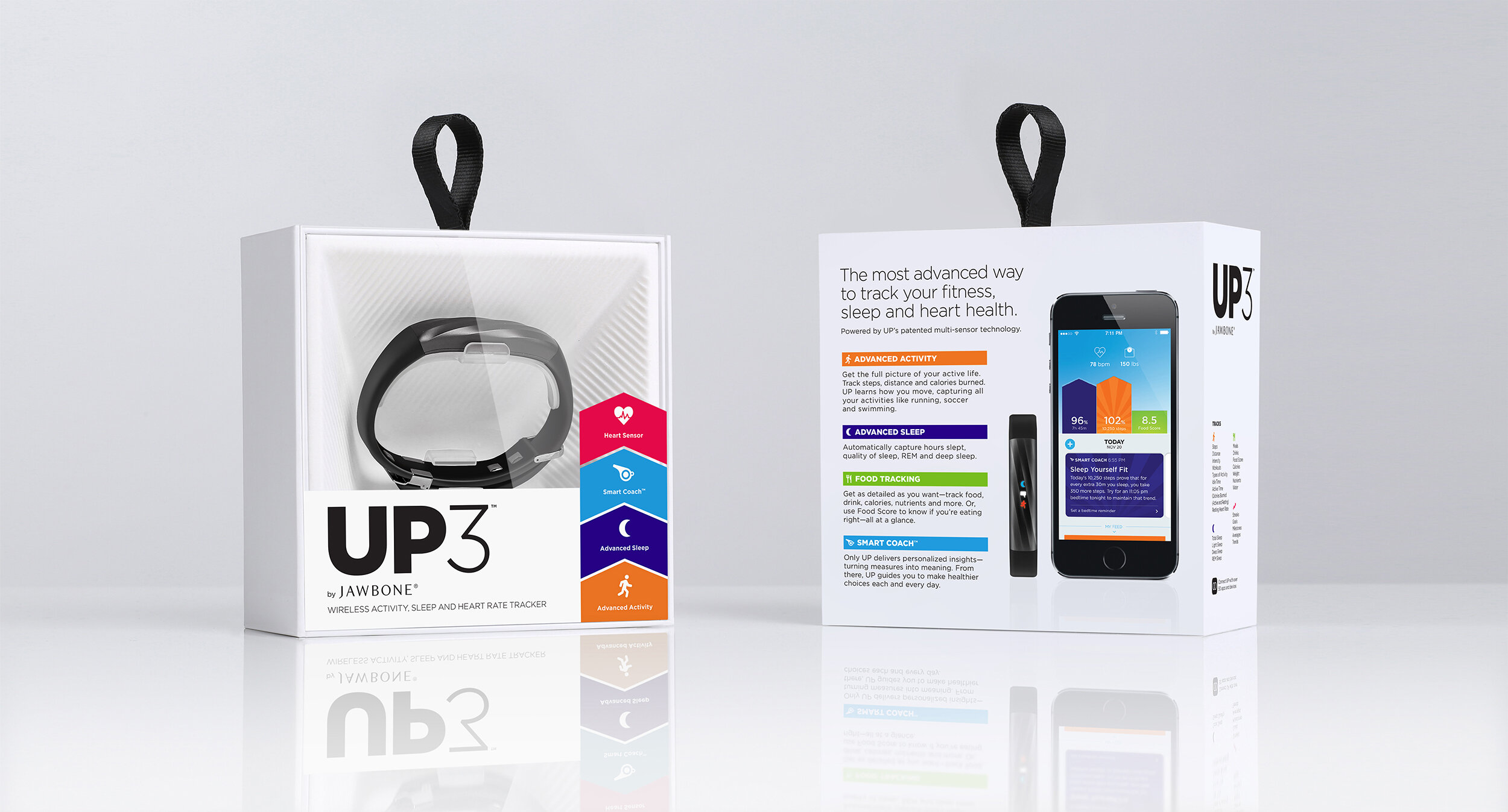
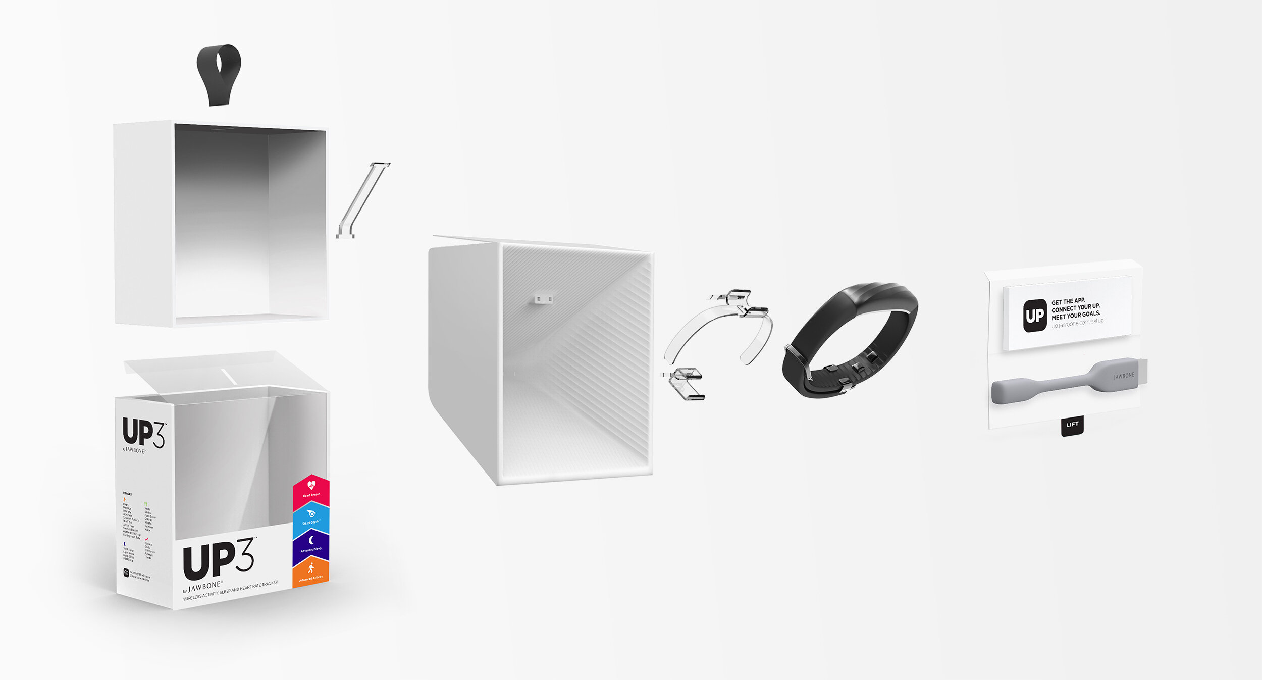
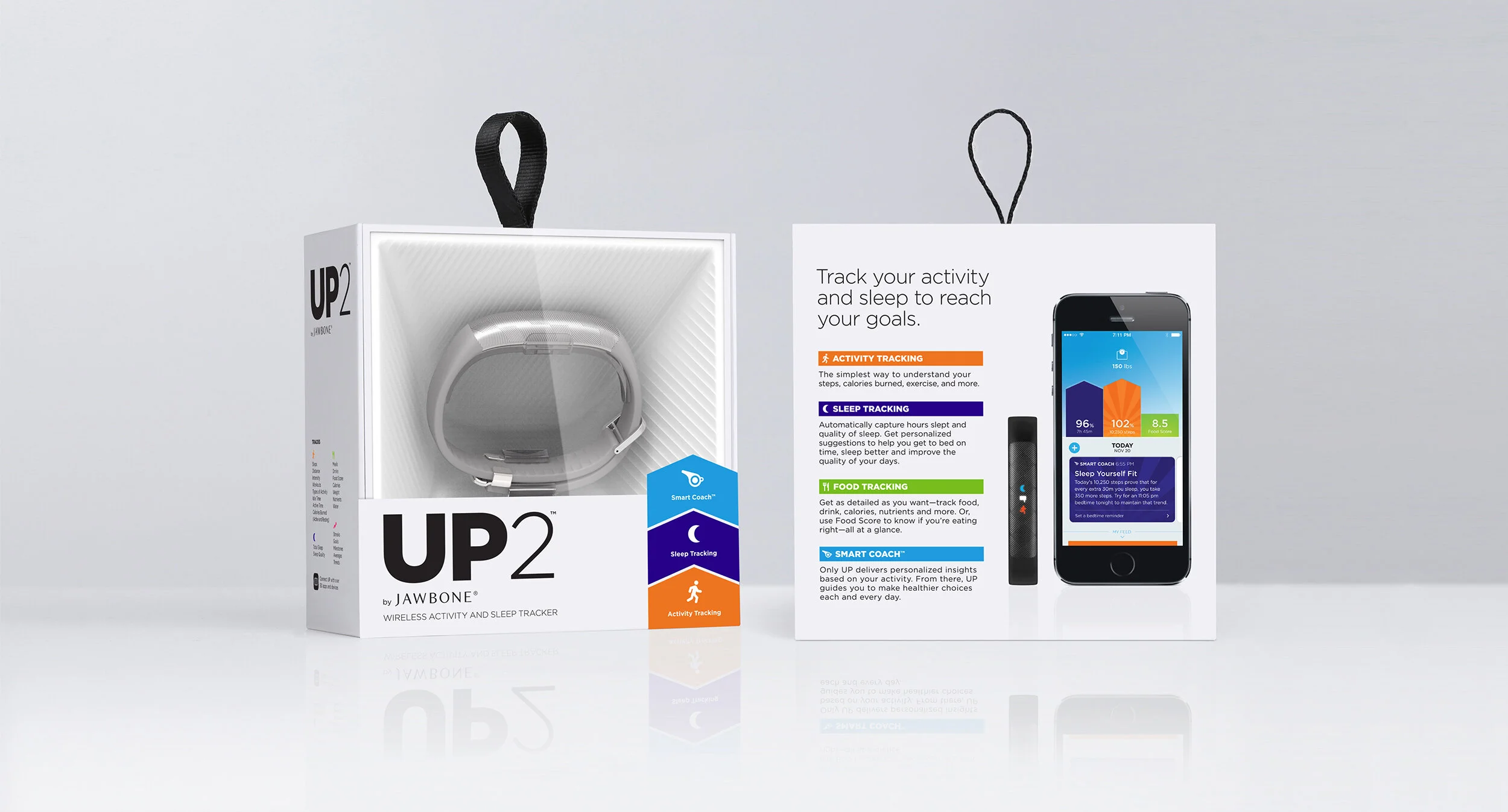
For the later UP-bands we maintained the same design principles – focusing on maximizing shelf presence while creating the best possible out-of-box experience. The packaging is an embodiment of the product – sturdy, and with high quality materials. Keeping with a very simple color palette of contrasting black and white, we gave it a bold and expressive presence on the shelf, almost like a billboard. The box looks almost like a display in a museum – you can see quality of the build and the materials through a window, rather than a photographic representation.
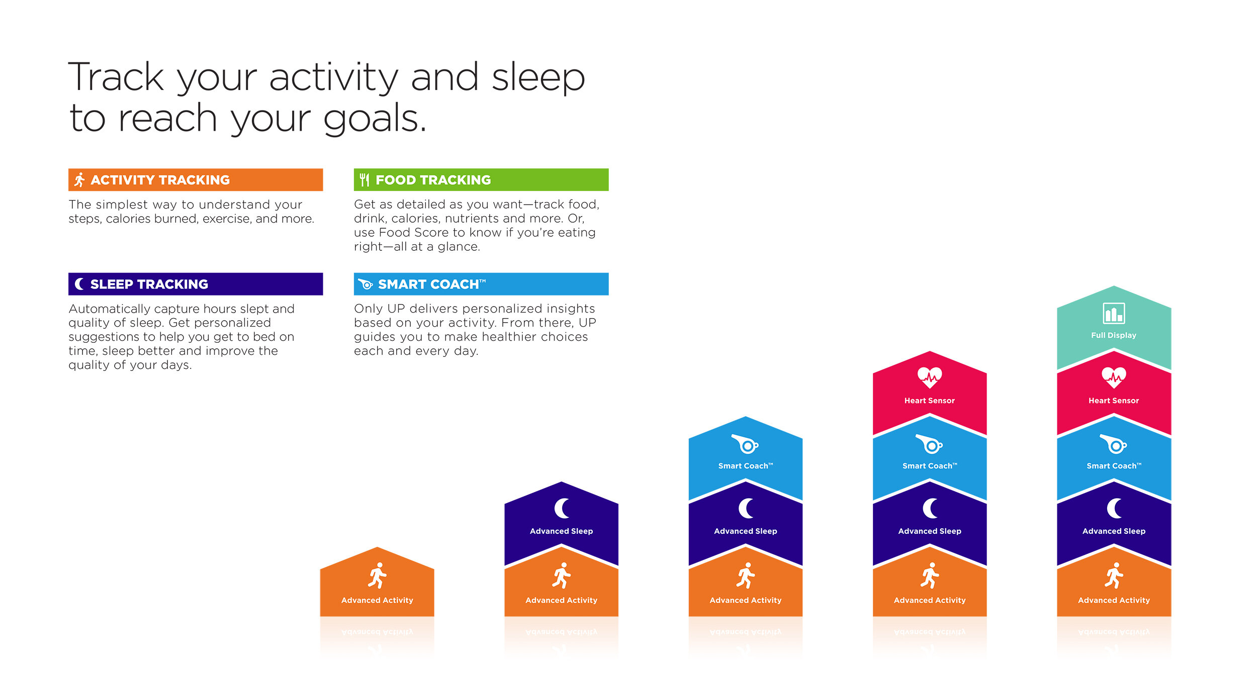
With the simultaneous launch of UP Move, UP2 & UP3 the packaging needed to show the different features associated with each band. We used a simple chevron graphic, inspired by the app design language, this helps to organize and categorize features for clear differentiation across the UP wearable line of products.
