Fightback

PROJECT: Fightback REBRAND
CLIENT: fightback
I worked on:
LOGO, BRAND GUIDELINES, PROMOTIONAL MATERIALS
TIMELINE:
2017
LOCATION:
nepal
Fightback is an educational program, teaching girls and women in Nepal and India techniques in self defense, situational awareness, and how to ward off sexual assault.
Challenge
The organization was seen as a purely physical fighting/exercise class, when it in reality teaches an equally weighted three-part program: mental, vocal and physical.
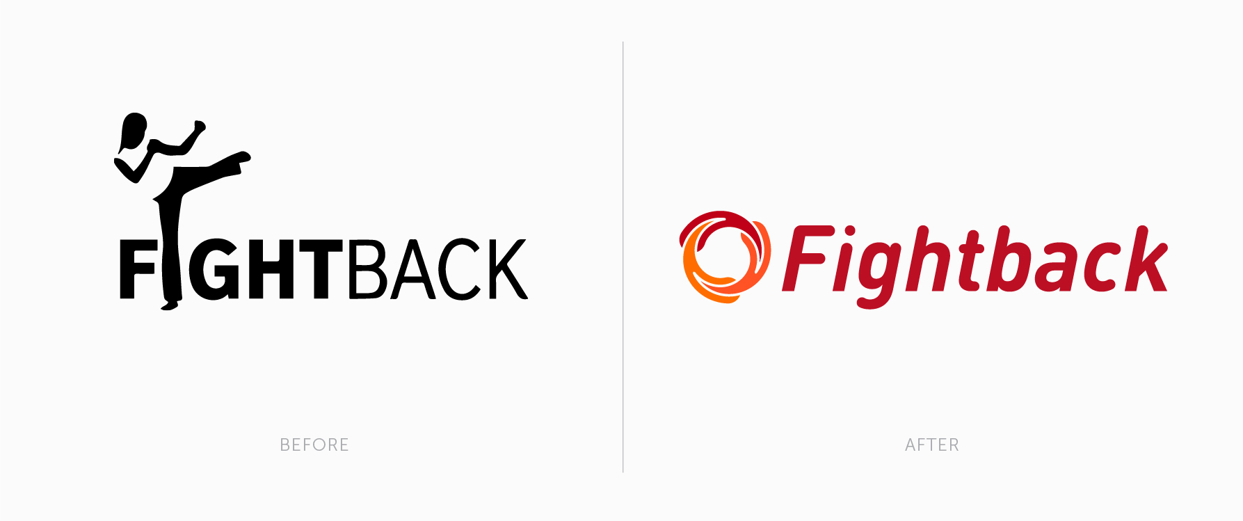
Their old logo disproportionately emphasized the physical part of the curriculum with the heavily weighted “fight“ and the silhouette of the kicking woman. I wanted to create a symbol and visual language that could communicate the same energy, but also balance the physical with the mental and vocal parts of the curriculum.
My Role
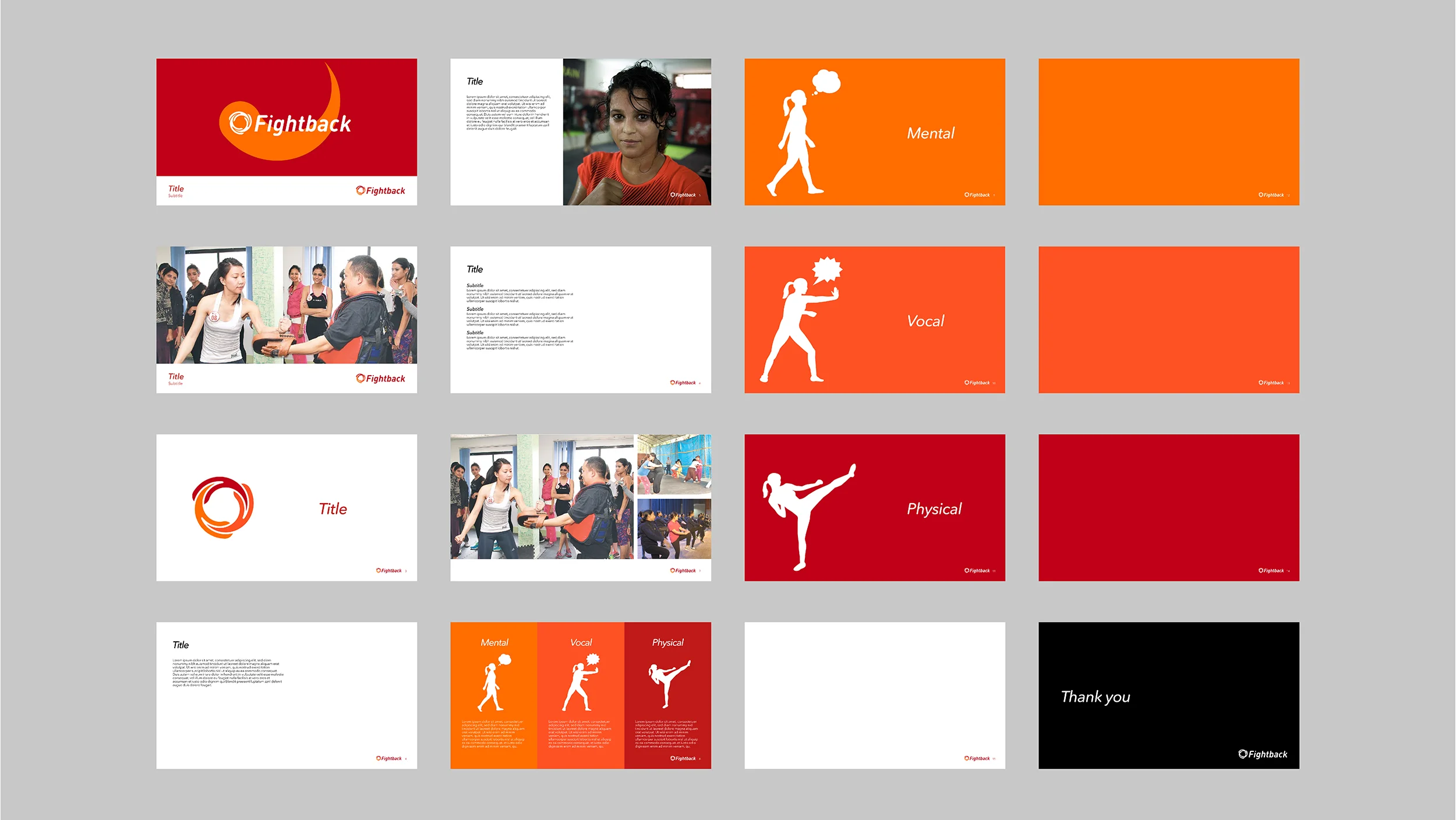
I was given the task of creating a new logo and visual identity as well as graphic tools for Fightback to clearly communicate all parts of their program.
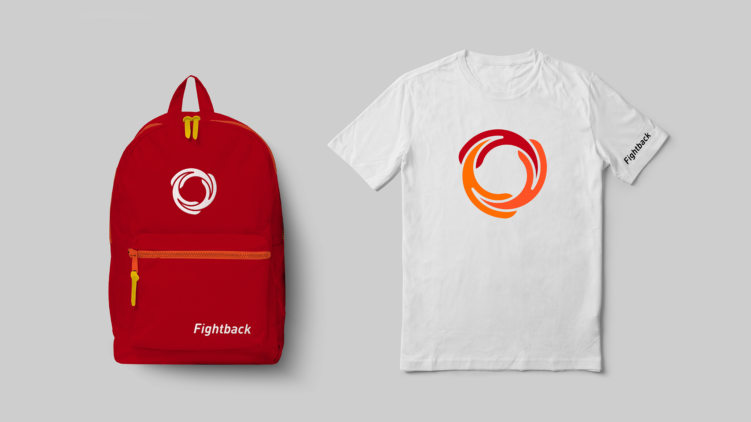
The result was “the Wheel“, a logo mark equally weighted in three parts, to signify the three areas of focus in the curriculum; Mental, Vocal and Physical, in progressively intense colors. It is constantly in motion, giving it an air of focus and alertness. The italicized type creates a sense of sharpness and agility, leaning forward in a fighting stance. The founder of Fightback said the movement reminded him of the Hadouken, a move from the video game series Street Fighter – which I thought was an apt comparison.
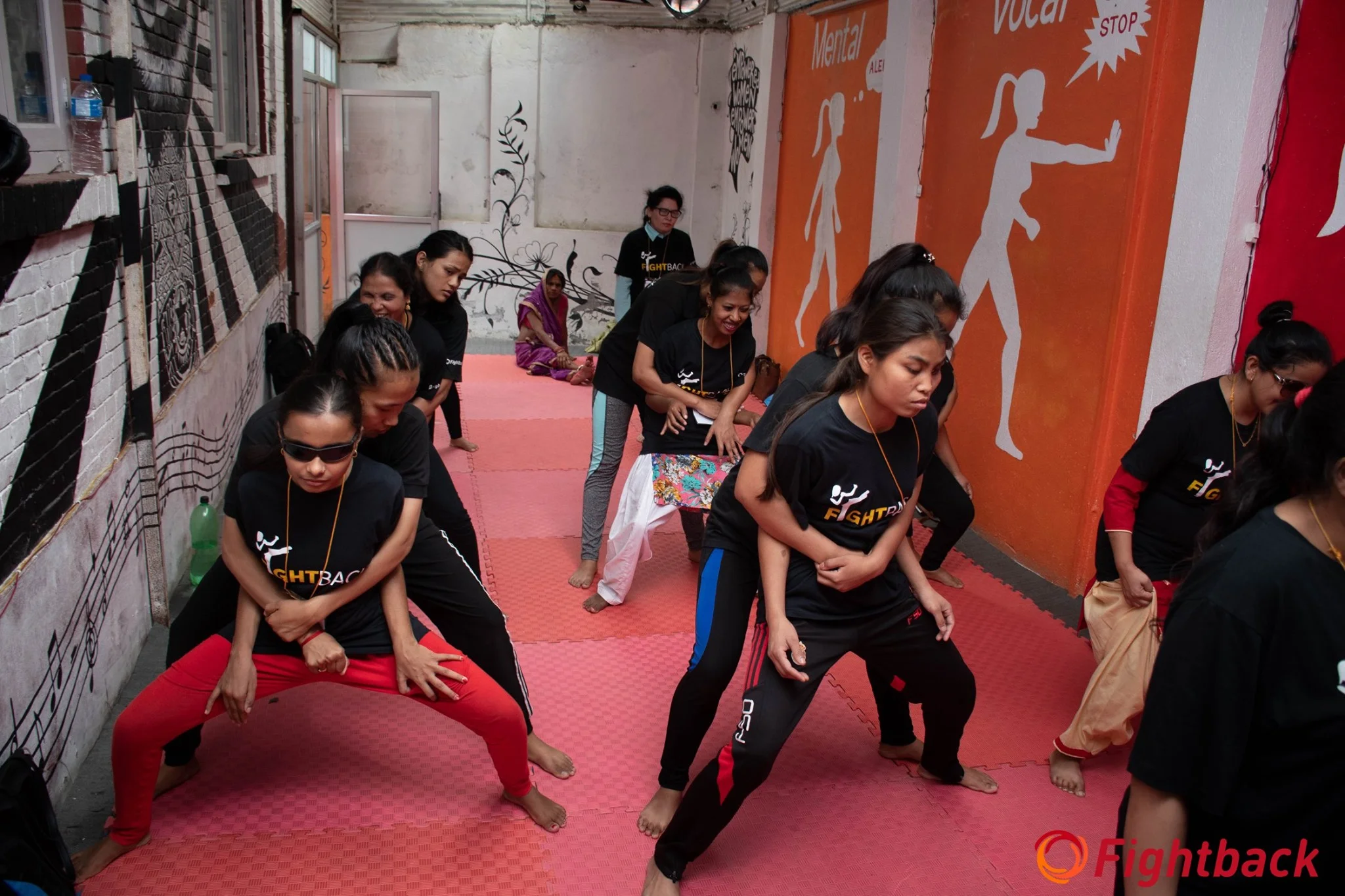
A mock-up that I presented, to give an idea of what a gym location could look like.
Outcome
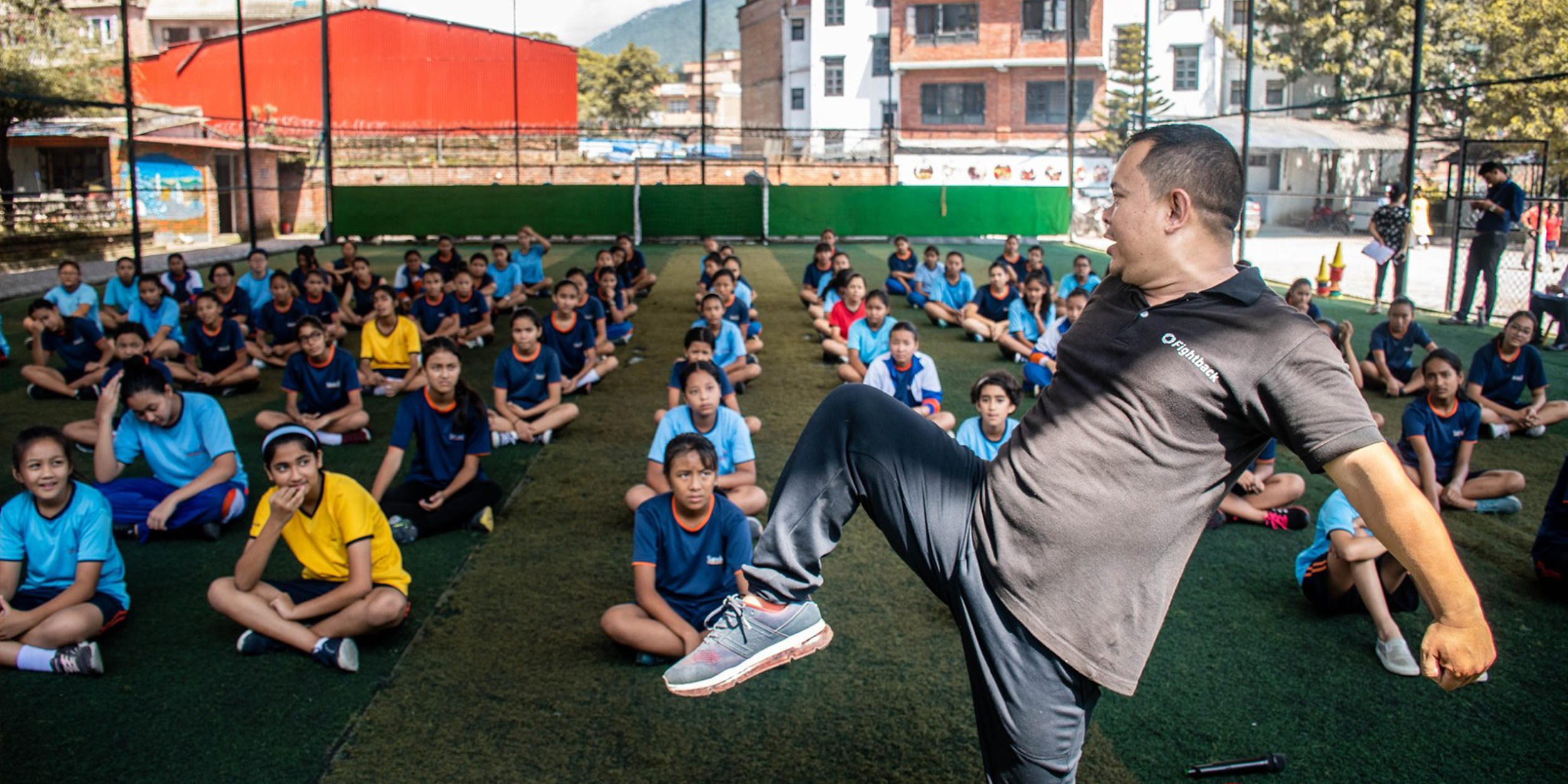
To date, Fightback has taught 8000+ women and girls in rural and urban areas, with 95% reporting an increase in confidence and skills. In many districts, girls are setting up self-managed groups to share their learning from Fightback with their peers. I’m very glad to have been able to help Fightback’s cause and I am looking forward to following their continued success and empowerment of young women.
“I am a Fightback Girl!“ It is great to see the brand assets be used and expanded on in an organic way!


